 Dadds.com site design and update
The site I have been poring my hard work into lately is finally finished. And by the time this post goes live, the site will be live as well hopefully. The biggest part of this project was taking all the old info and updating it for newer devices and services. I implemented a payment portal, HTML5 slideshow, a kick butt content editor, and a couple easy ways to incorporate videos and slideshows easily. So let's start with a small before and after of the website.
Home page
Here is the old homepage layout for Dadds.com

And here is the new layout. We have minimized the focus on the page to the opening article, and replaced all the various banners and text info with a few dynamic modules that will automatically adjust to the article size.

Limo-bus 25 page
Here is a sample of one of the pages on the old dadds.com. This page is about one of their limo-buses. The actual info did not start until you scrolled down a couple pages worth.

This was fixed with the new design. All of the slides/pictures are contained in a basic slider that scrolls by its self every few seconds.

Wedding Services Page
With this page, it was the same as all the others, laid out for one screen size, Gallery and videos took up most of the page, and the content was taking up a small part of it.

With the slideshow implemented, and the modules around the content, we can see a good portion of the content right off the bat. This is a good thing here.

Other Examples
Here are a few more examples for how the site looks now with a large resolution screen. This is how it would appear on 60% of the computers viewing it.


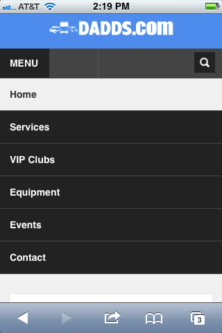
Mobile Phone Layout
Here are a few screens for how the site layout adjusts for mobile devices. These are what the view on a basic iPhone will look like. The only thing I'm not happy with on this view is that the pictures are still using a 650 width. If I use 100%, I get a slideshow the width of one row/module. So it is one or the other here :)


Mobile Tablet Layouts
When you view the site from a tablet, the format also shifts and you get a couple different content sizes depending on if the site is viewed in landscape or portrait mode.


0 comments:
Post a Comment